This is officially the most funnest project we have done in Infotech yet!
Posted by
Jenna
comments (0)
Posted by
Jenna
comments (0)
Christmas is always my favourite time of year. Every year my family, my cousins , my Aunt and Uncle, my Grandpa, my Great aunt and my Great grandma get together for 3 whole days (Christmas eve, Christmas Day and Boxing Day! It is so much fun (especially family games... home-made charades!). This year, we are going to my aunt and uncles house in Salmon Arm for Christmas. They have huge hill in their backyard for EXTREME sledding. For Christmas, I would like some clothes or books...and thats about it : ) except for chocolate. Chocolate is always good!

Posted by
Jenna
comments (0)

Since it is now FREEZING cold and winter is definately here, I plan to deal with the cold in two ways. Plan #1 is to wear tons of large fuzzy comfortable sweaters, my favourite touque and my olympic mittens! Plan #2 is to light my wood fireplace at home and read a book infront of it, while everyone else freezes outside. I personally prefer plan #2! I am very excited for the opening of Silver Star tomorrow! Even though I am not a big fan of the cold, I still enjoy skiing (especially when it is beutiful and sunny up at the hill). Another thing I am VERY excited for is Christmas!!!! and almost even more importantly WINTER BREAK : )
Posted by
Jenna
comments (0)
The only season I dislike is Spring but I still like parts of it (the sunny, green, flowery part). In order, my favourtie seasons are #1- Winter, #2 Fall #3- Summer but they are all very close : ) Here are some things I like about my three favourite seasons:
Winter
- SNOW!!!!
- Skiing
- CHRISTMAS!!!
- Christmas Songs
- Fireplaces
- Family coming down
- Winter Break
- Sledding
- Food
- New Years
Fall
- The leaves
- HALLOWEEN
- Its sweater seaon but its still sunny
- Its really beautiful
- Food
- All my activities are starting up again
- Hiking
- Thanksgiving
- No school
- Sun
- Swimming
- Friends
- Travelling
- Food
- Soccer
- No School
Posted by
Jenna
comments (0)
This is an animation that I made using the free program called Pivot. I really enjoyed making this and it was easy and fun. The program makes frame by frame animation seem so simple! There are so many cool things that you can make the stick figures do with just a couple slides. Here is one of my projects. I did all the animation on Pivot and then did the title and credits on Windows movie maker. I am really excited about how it turned out. Once again, I am not sure why there is a giant picture below the video...
Posted by
Jenna
comments (0)
This is an animation that I made on Fireworks. Even though it is very simple looking, it took quite a while because I did it frame by frame. When I was finished the animation on Fireworks, I exported it to Movie Maker and added the first and last slides. I thought it was really neat how easily I could add music to it as well. The animation is supposed to be a skydiver hitting a tree. I am not sure why there is a giant picture below the video....it is just there because Blogger is having a bad day!
Posted by
Jenna
comments (0)
I am extremely excited for halloween! Not that I will be doing anything exciting, but it is my favourite holiday besides christmas! For halloween, I plan to dress up as an 80s person. I have some pretty interesting clothes picked out including black and red tights...For the actual halloween night I am probably watching a non-scary movie with my friends and eating junk!

Posted by
Jenna
comments (0)
Hey Diddle Diddle

I made this comic on a program called Comic Life. To make this comic I only had to drag the pictures into the boxes, and it was very easy to add text. I based this comic on the nursery rhyme hey diddle diddle, and just tweaked the story a bit.
The Quest


I made these comics on Comic Life as well. For this story, I just made up a story line as it came to my head. It might not be a very exciting story, but I though it was amazing how easily I could create it. Mr. Crevier mentioned that this program could be used for projects in other classes and I think that is a really good idea.
Posted by
Jenna
comments (0)

This Photoshop project was called Visual Color Change. This project was one of the easier ones because it only took me about 15 minutes. I also think that the overall effect of the color change is very neat considering the time it took me to do it.

This Photoshop assignment was called (big surprise) 3DText. Out of all the projects I did, this one took the longest. I really liked the selection of different options you could have for this project. Unlike other projects, you can make this one more personal.

This Photoshop project is called Motion Effects. This project was pretty easy and only took about 10 minutes. With this picture, it was harder to get a clean-looking edit, but I liked the fact that you could change what speed the horse it seeming to go at.

My favourite project on Photoshop was Painting Away Color, the above picture. I really like the contrast the black and white photo provides to the one red lady bug. This effect was also surprisingly easy and only took me about 15 minutes.

This project was called Montage from 1 Image. My attempt at it didn't turn out too bad but it didn't turn out great either. You really have to have an eye for arranging the boxes around the edge. I like the picture of the tree though, because it has really beautiful fall colors.
Posted by
Jenna
comments (3)

I made this picture by combining a squirrel picture and a shark mouth. I am really happy about how it turned out! It is a perfect combination of cute and scary! It was actually quite easy to combine these, so I am going to show my brothers. I think that they will like it!

Posted by
Jenna
comments (1)

I made this logo for my website on Fireworks. First I took an ordinary Ying-Yang and put dolphin silhouettes in place of the small circles. Next I changed the color from white to a blue wave pattern. This logo symbolises how dolphins are so vital to the oceanic eco-system. It shows that even though they are both good and bad, the ocean, or ying-yang in this case, cannot be complete without them. My message with this logo is that if we keep killing off dolphins, it not olny affects them, but the entire eco-system as well.
Posted by
Jenna
comments (0)
For Thanksgiving this year, I am in Vancouver for a soccer tournament. On one hand, I am very disappointed that I will be missing turkey dinner at home with my family. It is always a special time of year for everyone. On the other hand I am very excited for the tournament. This will be my first tournament with my new team, and we are looking pretty good already. Also, I will not really be missing turkey dinner. The Grandparents of one of the girls is putting on a huge turkey dinner for the whole team and I am really looking forward to it!
Posted by
Jenna
comments (0)

Image created by Jenna Rever. Downloaded September 30th, 2010.
I created this image out of old magazine pictures. I really like how the words correspond with the picture and how the magazine clippings show up so well. All in all, I think the overall effect of the picture is pretty good.

Image created by Jenna Rever. Downloaded September 30th, 2010.
After I scanned this picture of my hand, I changed it up a bit on Picasa Picture Editor. I made the shadows more prominent and changed the picture to a sepia color. I really like how the hand looks in the different color. The sepia creates a less modern looking image.

My favourite part of this scan is the feather. I really like how defined it turned out after I edited the picture on Photoshop. To get this effect I applied the poster edges setting (under Filters-Artistic) to the photo and got the black outlined edges!

This scan is the exact same as the one above, except it was cut less, so it shows more leaves. Black and white is one of my favourite ways to change a picture because it makes you look at the picture in a different way. To get this effect on Photoshop I used the setting Halftone Pattern (under Filter- Sketch).
Posted by
Jenna
comments (0)
Ever since I was little I always have loved dolphins. It was one of my favourite things to go down to the Vancouver aquarium and see the dolphin shows and tanks. But then I saw The Cove by Louie Psihoyos. The Cove is a documentary about a secret cove in Taiji, Japan were dolphins are illegally and unhumanly slaughtered for meat and shows in aquariums around the world. This film really opened my eyes to how dolphins are being treated. I would like to base my website on dolphin treatment around the world, with a similar theme to this movie. Here is The Cove website if you'd like to learn more http://www.thecovemovie.com/home.htm.
Posted by
Jenna
comments (0)
I have only been in this class for 3 weeks and I have already learned how to use a lot of new programs. I think I am doing pretty well with my projects considering that I have only ever really used computers for research and e-mail. The projects I am most proud of are the 10 different pictures, my name plate and my copyright project. I was really happy about how all the pictures I took turned out. Something I really need to work on is describing my pictures more. The description can really help people view the image differently or understand it more.
Posted by
Jenna
comments (0)
Get Wired. (Online Image). Available: http://www.allgraphicdesign.com/graphicsblog/page/10/
Downloaded on September 23rd, 2010
This logo caught my eye because of the bright colors that are emphasised when put against the black background. Also, the random lines used to make the coffee cup give a crazy appearance and feeling (sort of like caffeine).
This logo caught my eye because of the bright colors that are emphasised when put against the black background. Also, the random lines used to make the coffee cup give a crazy appearance and feeling (sort of like caffeine).
Shark Racing. (Online Image). Available:
http://www.megalongcat.com/corporate-branding/18-awesome-logos-using-the-color-orange/Downloaded on September 23rd, 2010
I liked this logo because the orange man riding the bike really pops out due to his bright colors. The shark fin put on the mans back suggests intensity, and also emphasises the name.
I liked this logo because the orange man riding the bike really pops out due to his bright colors. The shark fin put on the mans back suggests intensity, and also emphasises the name.
Lion Hut. (Online Image). Available:
Downloaded on September 23rd, 2010
I chose this logo because I thought the picture and name were extremely creative. The warm colors create a savanna-like atmosphere, and the picture of the lion adds to that.
I chose this logo because I thought the picture and name were extremely creative. The warm colors create a savanna-like atmosphere, and the picture of the lion adds to that.
Wild Eye. (Online Image). Available: http://www.psdeluxe.com/category/articles/
Dogman. (Online Image). Available:
http://blog.karachicorner.com/2010/02/50-colorful-logos-designs-for-inspiration/
Downloaded on September 23rd, 2010
I chose this picture because of the color and shape choice. It is cool how the dog prints and footprints have been fitted together. Having these prints together suggests that this company is very dig friendly and kind to animals.

Transhift. (Online Image). Available:
http://blog.karachicorner.com/2010/02/50-colorful-logos-designs-for-inspiration/
Downloaded on September 23rd, 2010
I chose this logo simply for its unique design. I am not sure what the picture is of, but the design really catches my eye because of the use of different sized circles. For me, the picture seems electronic and new.

Monkeyfruit. (Online Image). Available:
http://blog.karachicorner.com/2010/02/50-colorful-logos-designs-for-inspiration/
Downloaded on September 23rd, 2010
I like this logo because of the relationship between the name and the picture. I think the apple with the monkeys face is very cute, creative, and emphasises the name. Using a cute cartoon makes this logo also seem friendly . I think that more people would use this program because the logo suggests it is easy to work with.

Mailephant. (Online Image). Available:
http://blog.karachicorner.com/2010/02/50-colorful-logos-designs-for-inspiration/
Downloaded on September 23rd, 2010
I chose this logo because of the originality of the picture and name. The picture made the name more memorable and drew my eye in because of the odd combination of an elephant and an enveleope. This logo is effective simply because the picture is unusual.
Wild Eye. (Online Image). Available: http://www.psdeluxe.com/category/articles/
Downloaded on September 23rd, 2010
I liked this logo because of its unique picture that relates directly to the title. It was cool how the creator made a "wild eye" and a camera in the same photo.Also, having the eye/camera as a cartoon and hiding behind a bush makes the company seem friendly and helpful. 
Dogman. (Online Image). Available:
http://blog.karachicorner.com/2010/02/50-colorful-logos-designs-for-inspiration/
Downloaded on September 23rd, 2010
I chose this picture because of the color and shape choice. It is cool how the dog prints and footprints have been fitted together. Having these prints together suggests that this company is very dig friendly and kind to animals.
Transhift. (Online Image). Available:
http://blog.karachicorner.com/2010/02/50-colorful-logos-designs-for-inspiration/
Downloaded on September 23rd, 2010
I chose this logo simply for its unique design. I am not sure what the picture is of, but the design really catches my eye because of the use of different sized circles. For me, the picture seems electronic and new.
Monkeyfruit. (Online Image). Available:
http://blog.karachicorner.com/2010/02/50-colorful-logos-designs-for-inspiration/
Downloaded on September 23rd, 2010
I like this logo because of the relationship between the name and the picture. I think the apple with the monkeys face is very cute, creative, and emphasises the name. Using a cute cartoon makes this logo also seem friendly . I think that more people would use this program because the logo suggests it is easy to work with.
Mailephant. (Online Image). Available:
http://blog.karachicorner.com/2010/02/50-colorful-logos-designs-for-inspiration/
Downloaded on September 23rd, 2010
I chose this logo because of the originality of the picture and name. The picture made the name more memorable and drew my eye in because of the odd combination of an elephant and an enveleope. This logo is effective simply because the picture is unusual.
Posted by
Jenna
comments (0)

Exaggerated Angle.(Online Image). Available: http://thorntonmegan.blogspot.com/
Downloaded on September 23rd, 2010
--This picture caught my eye because of the unusual view of the school field it provides. I really liked the angle because it is parallel with the grass, making the goalpost seem really tall.

Sun. (Online Image). Available: http://www.cameronlawrencesblog.blogspot.com/
Downloaded on September 23rd, 2010
--I liked this image because of the colors and perspective. It is really neat how the sun has been changed to look purple and the trees are all silhouettes.

Birds. (Online Image). Available: http://ashton-blog.blogspot.com/
Downloaded on September 23rd, 2010
--I like this picture because it is a great example of a silhouette. It is beautiful and I love the perspective it provides. The birds really stand out in this picture because of the editing done to the image.
Posted by
Jenna
comments (0)

Made on: Macromedia Fireworks 8
Size: Width: 400pixels Height: 200pixels
Background: I used the pattern Oil Paint 3
Font: Papyrus(White)
Font Size: 71
Edge: Feathered
For my name plate I wanted to create a more art-like appearance. By using the Oil Paint 3 background and Papyrus font, I hoped to create and image that looks a little more natural. I like my final product because it is colorful and not too flashy.
Posted by
Jenna
comments (1)
I can never really decide what my favourite movie is! Here are just some of the differents catagories of movies that I enjoy:
Kung Foo Panda
Although this movie is considered a kids movie, I absolutely love it, and having Jack Black as the Panda always helps!
Action:
- Star Wars
- Avatar
- Pirates of the Carribean
Horror:
I never watch horror movies because they absolutly freak me out!
Mystery:
- Sherlock Holmes
Romance:
- Leap Year
- Penelope
- P.S. I love you
Thriller:
Harry Potter. I am a Harry Potter fan and have read all the and seen all the movies. Even though most movies are horrible compared to the book, the producers actually did a good job with most of the Harry Potter movies. I am very excited for the 7th movie (coming out in November). Check out the trailer below!
Posted by
Jenna
comments (1)
I love all the Harry Potter movies and books. Can't wait for the 7th movie!
Posted by
Jenna
comments (1)
For my IT 10 class we were assigned a project to take 10 different types of pictures. Here are my favourites:
***All these pictures were taken by Jenna Rever and downloaded on 09-21-2010***
One Color Emphasis- I like this picture because of the similarity of colors. It is interesting to think that these creature are are almost the exact same color of our skin, when they are dried. I think that starfish are really neat creatures. This particular starfish was given to me by my friend, Rachel, as a souvenir from her trip sown the Oregon coast.

Exaggerated Angle- I love this picture because I am a piano player and really like how this picture turned out. It is an angle that is not very often viewed. It really caught my eye when I was trying to decide on my favourite.

Landscape- I took this picture while on a hike in Kokanee Glacier National Park. It was one of my favourite lakes(out of many), and definitely one of the most beautiful. The color of the water and the natural valley created, make this picture interesting. 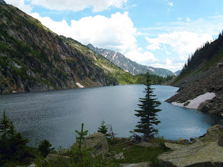

Reflection- This picture is also from my Kokanee Glacier Hike. I love this picture because of the waterfall going down the middle of the mountain. This picture is unusual because of the clarity of the reflection of the mountain. 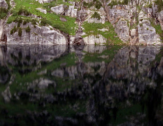

Landscape- This picture caught my eye because of the pattern on the water. The ripples created from wind make the water look textured. I also like this picture because it holds one of my favourite memories. When we were at this lake, my brother an I hiked out to the big rock on the right and at lunch while over looking the amazing view. 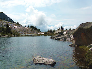

Close Up- I chose this picture because I really like the design on the design of the metal. It is amazing how people make such intricate and beautiful patterns. 

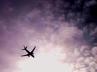
Silhouette- I picked this picture because I really like how defined the silhouette of the plane is. I also like the fact that the clouds are different shades; it makes the border clouds look ominous.
Close Up- I like this picture because of the fact that only the metal man in the middle is clear, and the surroundings are blurry, it puts extra emphasis on the focus of the picture.

Portrait-I love this picture. It is my favourite portrait because the faces are not directly in the center, like most portraits. My friend, Ashton(the one on the left), usually she doesn't let me take her picture so I am definitely keeping this one!

Something Man Made in Nature-I really like this picture because it emphasises the season fall and I think fall is the most beautiful season. I also like that the ladder and fence post create a border around the center of the picture.

Texture- I like this picture because it is a really neat close up of a leaf. The bright green of the leaf actually showed up quite well. I also found it neat how all the veins of the leaf showed up very clearly.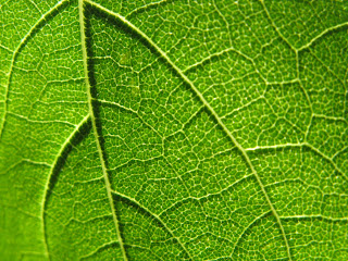

Something Growing in an Environment it Shouldn't be- I like this picture because it looks unusual. the fact that the weed should not be growing there makes the picture all the more different. Because the colors are all neutral, this picture is not as flashy as the others.

Posted by
Jenna
comments (0)

Posted by
Jenna
comments (0)
Whenever my family or I are planning to go to a movie, we always check Flixster. The ratings are a lot more accurate (and unbiased) than most movie theatre ratings. This site also has all the new movie trailers and summaries. My dad even has it as an app on his iPhone!

Flixster. (Online).
Available: http://www.flixster.com/
Date of Download: September 13, 2010
Posted by
Jenna
comments (3)
I met someone this summer that had this whole commercial memorized! It was hilarious to watch him (and hear him) get the tone of voice and facial expressions exactly like the guy in this commercial : )
Posted by
Jenna
comments (3)

Awesome Dog (Online Image)
Available: http://worldsfunniestanimalpictures.com/
Date of Download: September 13, 2010 BmpI chose this picture because I thought it was really cute. I love dogs and this picture was too adorable to pass up!

Castle in Ireland (Online Image).
Available: http://michaeldowey.bz/
Date of Download: September 13, 2010 Gif
I picked this picture because I thought it was beautiful, majestic and I have always wanted to go to Ireland. The the landscape and castles there are amazing!(according to the pictures and movies I have seen)

Space. (Online Image).
Available: http://ipakway.blogspot.com/
Date of Download: September 9, 2010 jpg
I picked this picture because it shows a really neat perspective of earth and the moon. I think that space is beautiful and this picture definately proves that!
Posted by
Jenna
comments (1)
This weekend I had Y-League soccer tryouts on Rutland sports fields, in the rain, for an hour and a half. Y-League is the soccer team for the Thompson Okanagan, and this is the first time I have tried out for this team, so I was nervous. The tryouts turned out to be pretty fun, and it was nice to be playing soccer again. I still have two more tryouts next weekend, and I sure hope it isn't raining again!
Posted by
Jenna
comments (0)
The first week of grade 10 is over! I am already looking forward to the volleyball season (first practice was on Thursday) and playing in the senior band. Even though I already have homework, I am happy to be back at school with my friends. I didn't get to see all of them enough this summer! This semester I have French, English, drafting, socials and band but I am looking forward to next semester because I have science and gym. In my opinion the summer went by way to fast. It feels like we only had 2-3 weeks off!